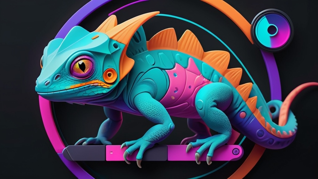
🦎 Flutter's Shape-Shifters: Mastering Dynamic Widgets
Unleash the Power of Adaptable UI Components
Welcome, Flutter enthusiasts, to the world of dynamic widgets – where your UI becomes as fluid as water and as adaptable as a chameleon! 🌈 Today, we’ll explore how to create widgets that respond to data, user interactions, and even their own state. Get ready to add some serious flexibility to your Flutter apps!
🧠 Understanding Dynamic Widgets
Dynamic widgets are UI components that can change their appearance, behavior, or content based on various factors:
- 📊 Data-driven changes
- 👆 User interactions
- 🔄 Internal state changes
- 📱 Device characteristics
Let’s dive into the techniques that will turn your static layouts into living, breathing interfaces!
🛠️ Tools of the Trade
1. 🏗️ StatefulWidget: The Foundation of Dynamism
StatefulWidget is your go-to for creating widgets that can change over time:
class DynamicGreeting extends StatefulWidget {
  @override
  _DynamicGreetingState createState() => _DynamicGreetingState();
}

class _DynamicGreetingState extends State<DynamicGreeting> {
  String _greeting = 'Hello';

  void _changeGreeting() {
    setState(() {
      _greeting = _greeting == 'Hello' ? 'Welcome' : 'Hello';
    });
  }

  @override
  Widget build(BuildContext context) {
    return GestureDetector(
      onTap: _changeGreeting,
      child: Text(_greeting),
    );
  }
}
2. 🎭 AnimatedWidget: Smooth Transitions
For widgets that need to animate between states:
class SpinningLogo extends AnimatedWidget {
  SpinningLogo({Key? key, required Animation<double> animation})
      : super(key: key, listenable: animation);

  @override
  Widget build(BuildContext context) {
    final animation = listenable as Animation<double>;
    return Transform.rotate(
      angle: animation.value * 2.0 * pi,
      child: FlutterLogo(size: 50),
    );
  }
}
3. 📏 LayoutBuilder: Responsive Layouts
Create layouts that adapt to their parent’s constraints:
LayoutBuilder(
  builder: (BuildContext context, BoxConstraints constraints) {
    if (constraints.maxWidth > 600) {
      return WideLayout();
    } else {
      return NarrowLayout();
    }
  },
)
4. 🔄 StreamBuilder: Real-time Updates
Perfect for widgets that need to react to data streams:
StreamBuilder<int>(
  stream: counterStream,
  builder: (BuildContext context, AsyncSnapshot<int> snapshot) {
    if (snapshot.hasError) {
      return Text('Error: ${snapshot.error}');
    }
    switch (snapshot.connectionState) {
      case ConnectionState.none:
        return Text('Not connected');
      case ConnectionState.waiting:
        return Text('Awaiting data...');
      case ConnectionState.active:
        return Text('Count: ${snapshot.data}');
      case ConnectionState.done:
        return Text('Stream closed');
    }
  },
)
5. 🎨 CustomPainter: Draw Your Dreams
For when you need ultimate control over your widget’s appearance:
class CirclePainter extends CustomPainter {
  @override
  void paint(Canvas canvas, Size size) {
    var paint = Paint()
      ..color = Colors.blue
      ..style = PaintingStyle.fill;
    canvas.drawCircle(Offset(size.width / 2, size.height / 2), 40, paint);
  }

  @override
  bool shouldRepaint(CustomPainter oldDelegate) => false;
}

// Usage
CustomPaint(
  painter: CirclePainter(),
  child: Container(
    width: 100,
    height: 100,
  ),
)
🧙♂️ Advanced Techniques
1. 🏭 Widget Factories
Create widgets dynamically based on data:
Widget buildWidget(String type) {
  switch (type) {
    case 'text':
      return Text('Dynamic Text');
    case 'button':
      return ElevatedButton(
        onPressed: () {},
        child: Text('Dynamic Button'),
      );
    default:
      return Container();
  }
}

// Usage
ListView.builder(
  itemCount: widgetTypes.length,
  itemBuilder: (context, index) {
    return buildWidget(widgetTypes[index]);
  },
)
2. 🔌 Inherited Widgets: Prop Drilling Solution
Pass data down the widget tree efficiently:
class ThemeProvider extends InheritedWidget {
  final String theme;

  ThemeProvider({required this.theme, required Widget child})
      : super(child: child);

  static ThemeProvider of(BuildContext context) {
    return context.dependOnInheritedWidgetOfExactType<ThemeProvider>()!;
  }

  @override
  bool updateShouldNotify(ThemeProvider oldWidget) {
    return theme != oldWidget.theme;
  }
}

// Usage
Text(
  'Themed Text',
  style: TextStyle(color: ThemeProvider.of(context).theme == 'dark' ? Colors.white : Colors.black),
)
3. 🧩 Composition over Inheritance
Build complex widgets by composing smaller, reusable widgets:
class ProfileCard extends StatelessWidget {
  final String name;
  final String imageUrl;

  ProfileCard({required this.name, required this.imageUrl});

  @override
  Widget build(BuildContext context) {
    return Card(
      child: Column(
        children: [
          CircleAvatar(backgroundImage: NetworkImage(imageUrl)),
          Text(name),
          FollowButton(),
        ],
      ),
    );
  }
}
🎭 Best Practices for Dynamic Widgets
- 🧠 Keep logic and UI separate
- ♻️ Reuse widgets whenever possible
- 🚀 Optimize for performance, especially with lists
- 🧪 Test your widgets in various scenarios
- 📚 Document your dynamic behavior for other developers
🏆 Conclusion: Embrace the Dynamism!
Dynamic widgets are the secret sauce that can take your Flutter apps from good to great. They allow you to create responsive, interactive, and engaging user interfaces that adapt to user needs and data changes.
Remember, with great power comes great responsibility. Use these techniques wisely, and your users will be delighted by the fluid and responsive nature of your app.
Now go forth and create widgets that don’t just sit there – make them dance, adapt, and bring your Flutter apps to life! 🚀🎉



Comments